
"Easy Ivy"
A Look at the Recent Beams x Bodega x Adidas Collaboration

Last week, Bodega, a Boston-based streetwear shop released a capsule collection in partnership with Adidas and the Japanese Americana brand Beams.
I’ll be up front with you guys and say that I don’t like it — and judging by your response to my Instagram poll, you guys didn’t like it either. Let’s talk about why this capsule just doesn’t work, though:
The capsule is called “Easy Ivy“ and is meant to reflect on the fashion influence of having the most prestigious university in the world sitting in your backyard (from the perspective of the Bodega creative directors, that is). From their editorial:
“Whether you had memories of riding the train up from the suburbs or taking the bus from another part of the city, when the Ivy League is in your backyard, your relationship with it is a little different than the outside world … So when it comes to repping the school or the ivy aesthetic, it's not as much a question of if but how. From skaters and ballers to construction workers and janitors - heck even students at neighboring colleges, everyone is rocking gear. Why should the buck stop at the enrollment list anyway?”
As a side note, I think they mean Harvard merch specifically when they say “everyone is rocking gear“. I can assure you that Boston is not a fashionable city and most people aren’t walking around in 1950’s Ivy League style cosplay.
An additional side note: The copywriting for this campaign is bad. Like, insulting-my-intelligence bad.
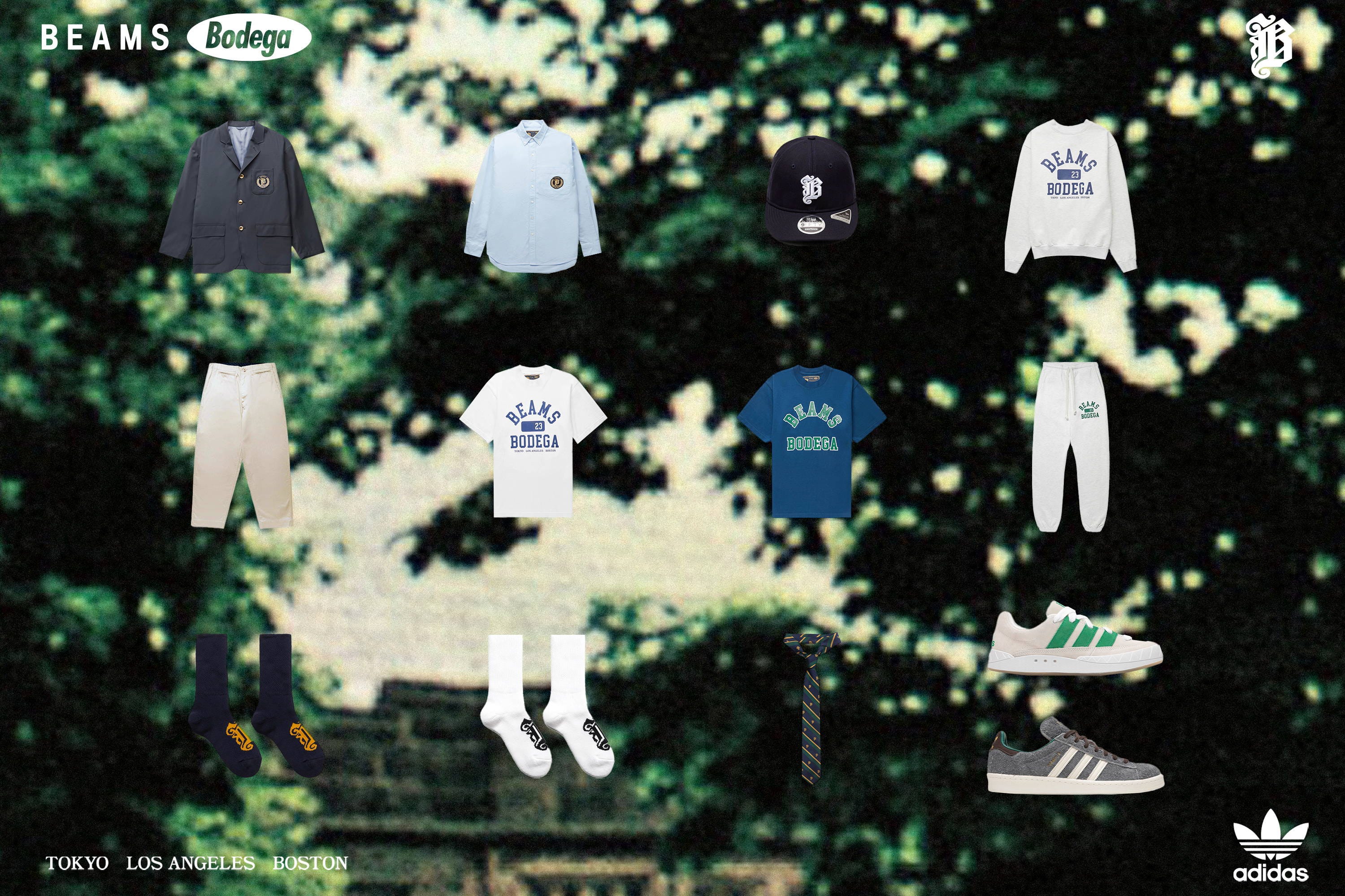
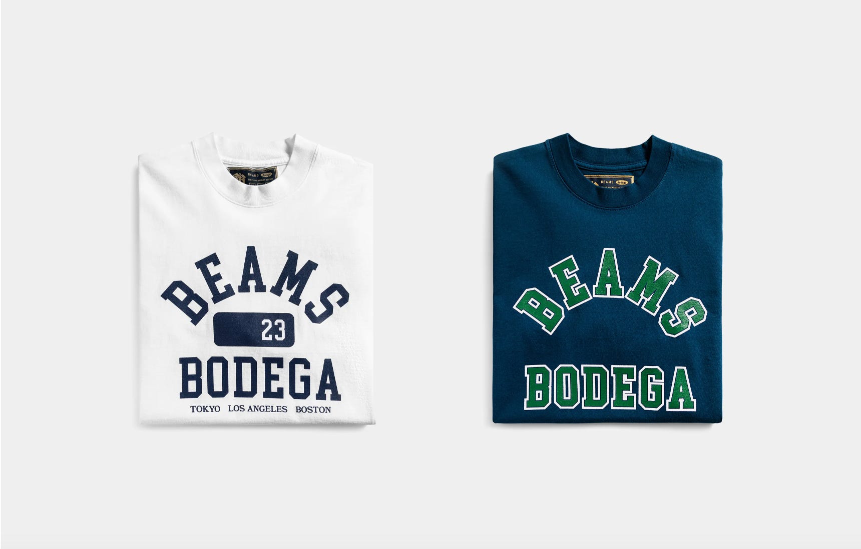
The capsule itself consists of a hat, an oxford shirt, a navy blazer, wide-fit khaki chinos, a tie, a crewneck sweatshirt and sweatpants, two t-shirts, socks, and the centerpiece, two pairs of Adidas co-branded shoes, for a total of 13 pieces.
Before we jump in, allow me to indulge in a bit of conspiratorial thinking: I think this entire collection was made just to sell the shoes, and the actual clothing was moreso an afterthought.
I’ll put some additional thoughts at the end, after we get through the clothes themselves. From their official “closer look”:
From the “closer look“ article:
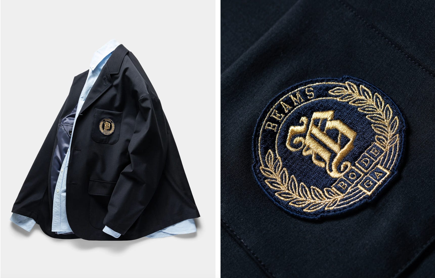
Crowned with an unstructured 3 button blazer with a chest crest and two flap pockets, is it just us or is the wall between casual wear and formal wear suddenly crumbling?
It’s just you.
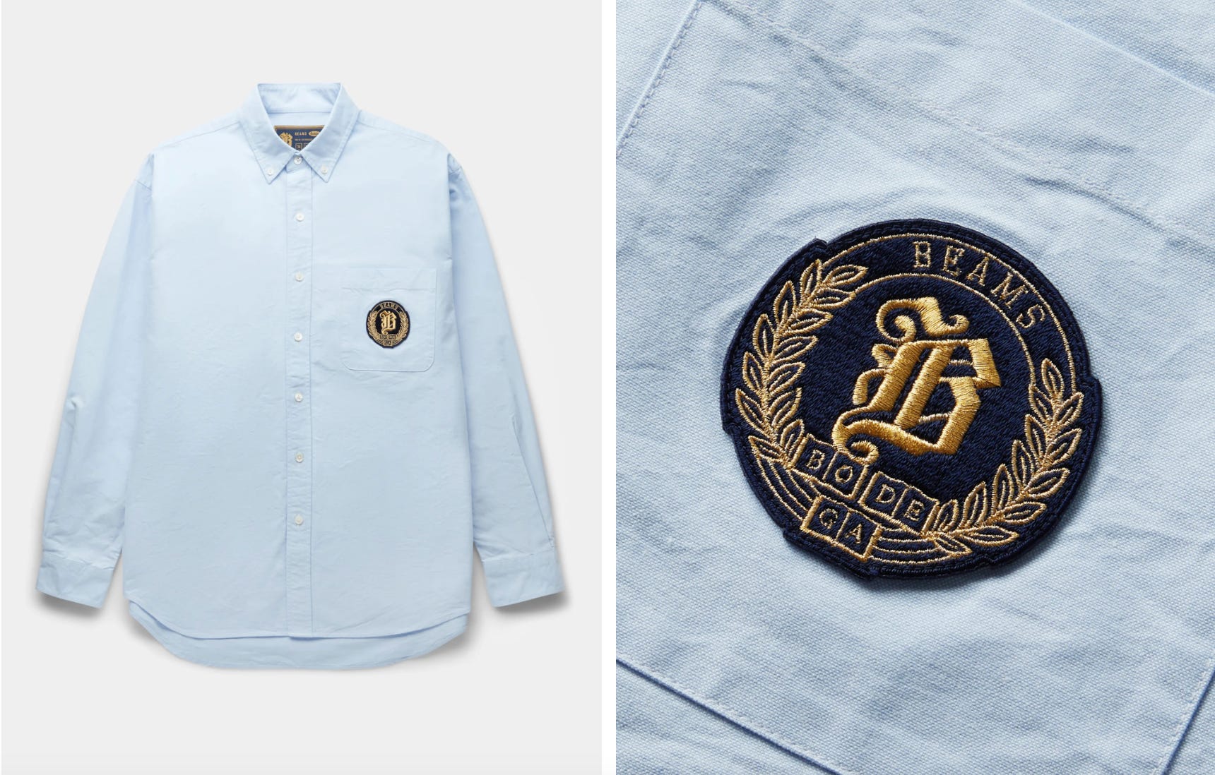
Starting off with the most quintessential of symbols, the oxford button down looks straight out of an old department store’s window display but with a crest and relaxed cut to let you know we are not dealing with ‘old-stock’.
Yes, the old stock famously loves /slimfit/ and definitely isn’t known for wearing shirts with so much extra fabric that they could double as parachutes.
This is fine, reminds me of Rugby Ralph Lauren (same with the other garments featuring the crest).
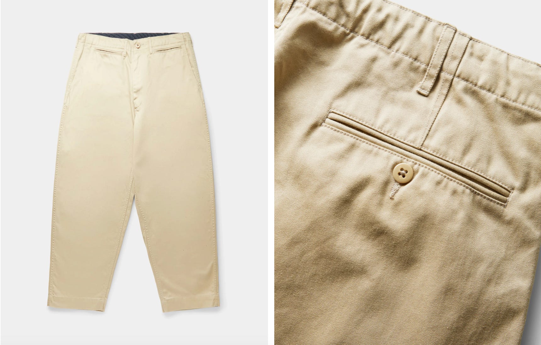
Next up are the khaki pants which once again seem boiler plate from afar, but features like an inner ribboned waistband, dual watch pockets, drawstring waist, and baggier cut will compliment sneakers over loafers 8 days a week.
You can feel the Beams influence here with the wide-fit “flood pants“ that the brand likes to feature. The rest of the features are pretty boilerplate though.

Consisting of two tees, a crewneck sweatshirt, and classic cuffed sweatpants, sure you can piece them out and rep the school of hard knocks individually but it’s no coincidence that it all works as a sweat suit, perfect for lounging around or getting screamed at by a gym teacher with a chip on his shoulder.
Pretty standard, nothing of note to justify price point. Seems like they’re describing a prep school and not a university (kind of the wrong demographic but whatever).

Same as above
Same as above

Both shoes are pretty inoffensive honestly — pretty conservative colorways by and large. The AdiMatic is a classic sort of puffy Etnies-like skate shoe — the teeth going across the front is kind of funny.
The Campus Features the other brand collaborators’ names in gold print on the medial plane of the shoe, which is a nice touch.
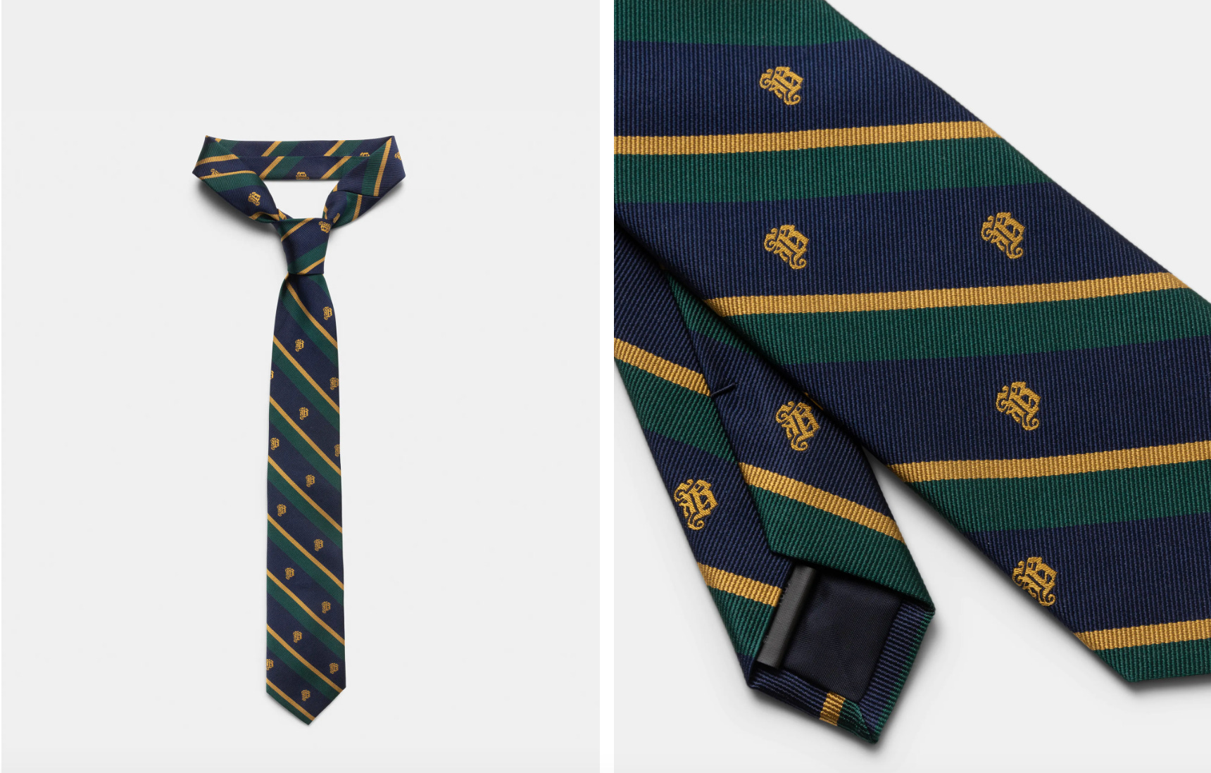
Okay so out of the 13 pieces in this capsule, four of them draw from what could reasonably be called ivy style: The blazer, the tie, the oxford, and the khakis. The rest of the collection consists of overpriced sweats and t-shirts, in addition to the focal point of the capsule, the shoes.
The intent with this capsule seems to be a way of juxtaposing edgy/rebellious skate culture with snobbish, uptight style of the past, sort of as a way to say “move over WASPs, your style belongs to the youth now,” but is that really the way that the collection comes across?
I mean prep/ivy style in itself was originally a rebellion against the snobbish, uptight style of the WASPs of the past, and every time it regains popularity theres some iteration of rebelling against the prior form of rebellion.
In a chat with one of my followers, Guy Stephen Moreno, he said the following regarding the stylistic direction of this collection:
Cool items but styled poorly; is it a sincere attempt at ivy or is it irreverence? It can’t be both
I think that this touches on the core of the issue at hand — the items themselves, as noted, aren’t particularly offensive or anything — the oxford’s collar looks a little flimsy and small nitpicks like that kind of hold it back materially, but the styling really makes me question who this is supposed to appeal to.
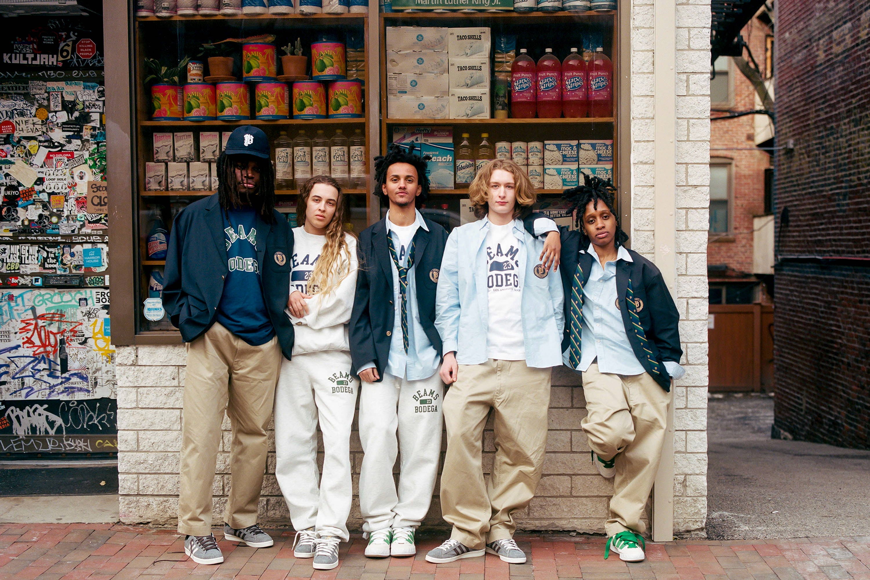
For example, in the picture above, look at the way the guy all the way to the left is wearing the khakis. They look like perfectly normal pants. This is in stark contrast to the two on the right, where the pants are literally falling off of their bodies. It’s not something that can be chalked up to height difference either. The guy on the left is visually 3-4 inches taller than the guy on the right, but the guy on the right appears to have about 8 inches of extra fabric pooling at his ankles, not to mention the rise looks like it starts at his mid-thigh. Didn’t we leave sagging in like 2005?
Like are the stylists just aging and unable to get with the times? Isn’t this whole collection taking a pot-shot at people exactly like that? Feels that maybe some irony was lost along the way.
It’s also weird in my opinion to pull in Beams on a project like this. If you’re unfamiliar with the brand, they’re essentially the epitomization of Japanese Americana. Starting with the release of the book Take Ivy in 1965, ivy style became a huge hit in Japan, and the country has acted as a steward for the style over the years, especially as favorability began to wane stateside.
Beams is one of the larger Japanese brands that continues to promote and playfully adapt ivy style to the modern era, even going as far as naming a recent lookbook “ALL YOU NEED IS IVY“. It’s pretty much impossible to doubt the expertise of the Beams designers and stylists — they’ve been putting out excellent Americana-styled collections for a very long time now, which is why it feels weird and rather out-of-place to see their name attached to a lackluster blazer and oxford that feels like an imitation of the video game Bully.

And look, you can’t fault a brand for hopping onto trends — they do have to maintain their cultural relevance after all. But considering you “have the ivy league in your backyard”, one might expect some reflection on this trend cycle (and its many previous iterations) as part of the design process.
Why go in this direction if you’re a streetwear brand? It’s not your brand’s style, your editorial makes it clear that it isn’t your style, and your core constituency probably isn’t putting on a blazer regularly.
On top of that, who exactly is this clothing collection for? It vaguely targets skaters, so you’d think it was meant for that crowd. At any rate, it’s clearly not meant for the people who enjoy the style as a niche interest, but is it really for skaters either? Do people even skate anymore? Is it for people who just kind of enjoy the skateboarder aesthetic? Are we in some some sort of Baudrillardian hyperreality situation with skateboarding?

I don’t know and I don’t care, and honestly I just wanted to use the word hyperreality. The point I’m making here is that this clothing is unappealing to basically any group of people that they might be targeting with this campaign, and given the fact that this is marked as a collection that was expected to sell out and literally everything is in stock in nearly every size besides the shoes and tie makes me feel vindicated in believing my conspiracy theory from the beginning of the article.
Also I hate to be the guy who just wrote 1500 words absolutely trashing a brand’s collection and then turn around and be like “I’m not angry about this,“ but I’m going to do it anyway: I’m not mad, I’m just disappointed in the execution.
This could’ve been a fun little capsule that conceivably could’ve introduced more people to something outside of their cultural boundary. Instead, we got a low-effort shitpost in clothing form. The editorial copywriting for this does actually kind of make me mad though — It’s seriously bad.
Okay that’s it I guess — I’m not used to writing negatively about stuff, so I hope that was coherent enough for you guys. Either way, let me know if you agree or disagree with my thoughts on the collection.
See you next week!
Should have collaborated with the Andover Shop.
Been trying to think what the collection reminded me of since I saw the pictures, you nailed it with the Bully comparison exactly what I was trying to get to